Below is a lesson that I planned for a group of 3rd graders but can be used across grades. We looked at researching your subject matter. There was a big focus on learning how to see – breaking complicated images into their simplest shapes. Value and color where also touched on as were light source and looking for clues on lighting direction. Lastly, a small demonstration of techniques in using pastels.
I approached the owl project a little differently than some of the other classes. My goal was to show how a classically trained artist might approach a project. In doing so, I wanted to introduce and/or reinforce the steps that most arts use to approach a work. These are steps that anyone can use to learn to break down a project to make it less intimidating, solve problems and learn to ‘see’. I had the kids work with oil pastels on yellow colored construction paper. As it was for Square One, I pre-cut the paper into 9×9 inch squares. I also went through several boxes of Oil Pastel to weed out the pieces that were no longer usable and even out the palettes for each table. I found giving each kid scrap paper of the same stock so they could experiment and test things before committing was helpful also.
Materials:
- Yellow construction paper, pre-cut into 9×9 inch squares
- A piece of scrap paper of the same material to experiment with technique
- Teacher’s computer and smart-board
Steps of a classically trained artist:
- Examples approaching both a realistic and graphic illustration – same steps.
Step one:
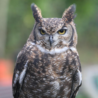
Talk about researching your subject. In this case, owls.
Yay internet! Collect photographic and illustrative reference. Limit your time in doing this so you don’t fall down the rabbit hole and not get any work done. As an example I set the time for myself to 20 mins. when preping for the kids. Important to talk about time management.
Step two:
Show the research and analyze it. This is where we start talking about and finding shapes in our reference.
First have kids look at the unaltered photo and point out the shapes they see.
After they’ve named off several pop to the ‘La Lucha’ versions to see the shapes super imposed on the previous image. We went through the next set of three.
 |
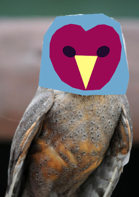
| Oval, diamond, half circles, chevron, etc. |
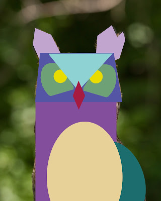 |
| Rectangle, diamond, circle, triangle, ovals, trapezoid, etc. |
 |
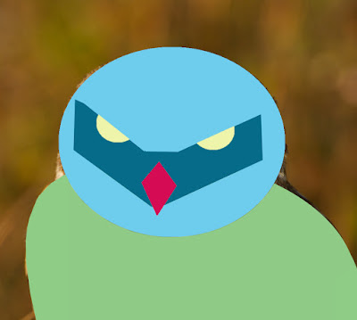
| Triangle, ovals, heart shape, etc. |
—————————————————————————————————————–
- Continue to find shapes in the more graphic versions.
Stress that all styles are valid. Look at how certain shapes may be exaggerated or down played.
—————————————————————————————————————–
Step three:
We talk about value and show the following pictures.First showing just value, second showing value in relation to color.
 |
| Value |
|
|
|
 |
| Value in color |
|
—————————————————————————————————————–
We continue talking about value as we introduce light source (sun, lamp, etc.) and how it effects value. How value creates an optical illusion, a tool that allows our 2D illustrations appear 3D. Start with the outlined circle, ask what it is then pop to the next image of the same circle now appearing to have dimension due to the implementation of value/shading.
—————————————————————————————————————–
Step four:
Go over techniques of using oil pastels. Focus on blending of colors. In retrospect, I would have liked to spend more time on this.
—————————————————————————————————————–
Step five:
Show two variations on the project and the steps in creating them. Go though the steps as examples and discuss. The kids should see the images before they start their work. This is not for them to copy but to start internalizing the process and begin to find their own solutions.
First demo – A more realistic rendering based on photo reference.
 |
| My reference photo |
|
 |
| Talk about using a colored ground (in this case the yellow paper). It functions as our mid tone and is the place we start. It let’s our eyes judge our darkest darks and our lightest lights. The tone from the colored ground will also come through the work adding a warmth to the final piece. We start finding our basic shapes and lightly sketch them in. Kids can use pencil or pastels. Its a time to experiment and learn what works for them. |
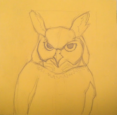 |
| Continue adding in shapes. Going from broadest shape to more detail – it’s a process of dialing it in. Look at their relationships to one another. Make alterations if needed. |
|
 |
| Start thinking about our light source. Where is the sun coming from? Where would shadows fall? Where are our darkest darks? |
|
|
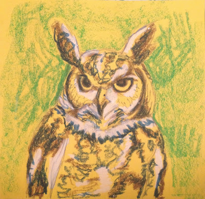 |
| Now that we’ve found our extremes in value, we start to dial it in by darkening our darks, lightening our lights and blending between them with mid tones. We can also start adding in our background. |
|
|
|
 |
| From this point on its a matter of refining. We continue to dial in with blending and pulling out details. Here I stress that the finished product takes patience and time. This is a process of layering and building up the final image. |
|
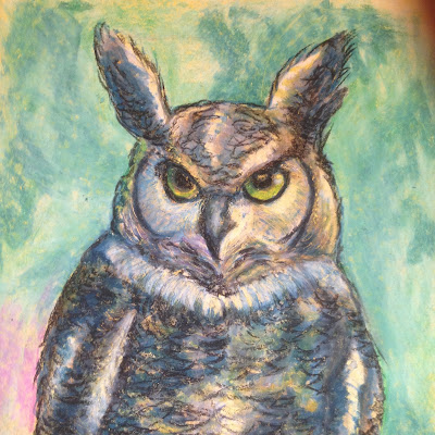 |
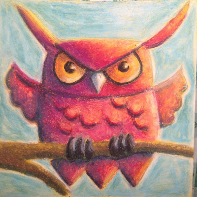
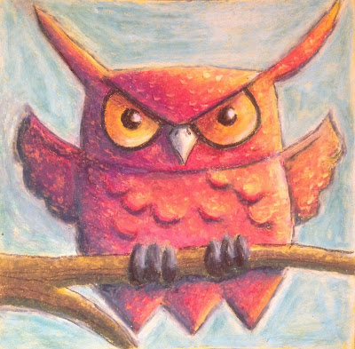
| For our project, this is the stage I consider my owl done. |
Second demo – A more graphic solution based on imagination using shapes we’ve observed while studying our owl reference.
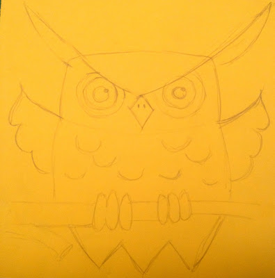 |
| Again I use a colored ground. I think of basic shapes observed and what shapes I want to base my owl on. I begin by lightly sketch them in. Kids can use pencil or pastels.Again, its a time for them to experiment and learn what works for them. |
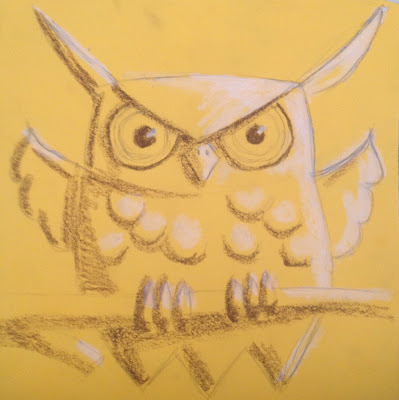 |
| Adding darks and lights. Thinking of our light source and how it brings dimension to our basic shapes |
 |
| Starting to add color. |
 |
| At this point I start blending. As before, it’s a matter of layering – start to dial it in by darkening our darks, lightening our lights and blending between them with mid tones. |
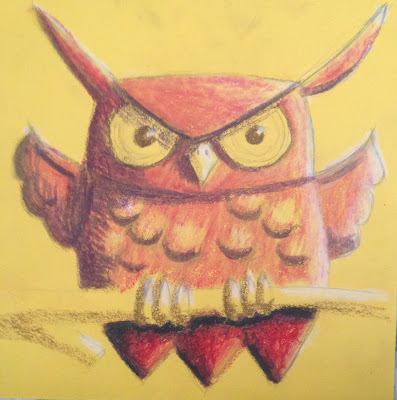 |
| Starting to build up more contrast. |
 |
| Continuing this through the entire piece. |
 |
| Here I started to experiment with what it might look like if I pulled off pigment with my fingernail – seeing if I could create more of a feather texture. Decided I wasn’t so happy with the effect in this case. Stress that making a ‘mistake’ is no big deal. I’m glad I tried it but since I’m not happy with it, I can go over it with blending and continue my progress. Experimentation is great!! If you don’t try new things and let yourself fail, you’ll never grow and never discover anything great. Mess up a lot, discover happy accidents that’s how we learn and grow our skills. |
 |
| Fleshing out the image by continuing my layers and adding details. |
 |
| Process continuing, starting to add background. |
 |
| It’s starting to pull together. |
 |
| Experimenting again with pulling off the oil pastel. |
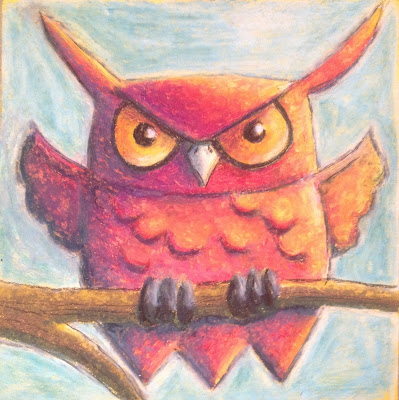 |
| Ultimately, I decide against pigment removal. Do a final pass of blending to even out the texture and call the owl done. |
—————————————————————————————————————–
Final observations and thoughts on how to improve future lessons:
This was a fun exercise. We had an hour for the entire process. I spent about 20 minutes on the lecture having the kids finding shapes asking questions, etc. In retrospect, I would have liked to spend a bit more time with oil pastel technique and a normal practice exercise (shading a sphere) as this part got a little lost in the middle.
The kids were very engaged. They enjoyed finding the shapes and they loved all of the photographic and illustrative reference. I tried to stress that the graphic solutions were just as valid as the more realistic renderings. Each style has its merits and to think about what story, if any, they are trying to tell. What style might convey it best and why.
The kids had 40 minutes to work on their own project. Most of them completed in this time frame. For the few who did not, they were able to finish up during recess or take the work home.
I was most struck with how many time I was asked if they were ‘doing things right’ or if their work was ‘good’. I’ve been thinking a lot about how to handle this and what message I want the kids to come away with.
My thought and things I would like to implement in the future in no particular order:
- Artists and art are not magic. Artists do not pop out of the womb being able to make a masterpiece. It takes a lifetime of practice and study of many subjects.
- That they (the kids) are practicing is good. Period.
- Practicing and failing, getting up, trying again ad nauseam is how we become skilled.
- ‘Good’ is subjective.
- Show early works of kids their age who later became working artists – to have kids witness that the work is pretty similar to what they are producing.
- Compile a list of inventions that were created by ‘mistake’ – to help kids see that experimenting and messing up is how we build our skills and is the way we discover things we would have never thought of.
- The process of creating art is the process finding solutions to problems.
- Show the process of a ‘master’ – the sketches, color studies, normal paintings, failed attempts, etc that lay the ground work for the actual ‘masterpiece’.
- Stress that every piece of work will not be a masterpiece – the more one practices they better s/he will become and mistakes are an essential part of bringing their skills and work to the next level.
- An artist is always working on improving his/her craft.
Things to allow more time for:
- Techniques and practice handling of material – oil pastel
Tip:
Before presenting to the class, take the time and work through your own example. Then do a practice presentation to your kid(s). Work through the project together – they will let you know what works and what doesn’t. Both steps will help you have a physical understanding of the process and build your confidence as you’ll have an idea of what to expect.
Another thought:
Some kids may say they can’t do it and want you to help. They are all very capable even if they don’t believe so. Sometimes I’ll give them a couple of suggestions but I’ve made it a point to never do the actual work for them. Give them things to think about, but they need to solve the problems themselves. Have them remember to break things down to their simplest shape then see how the shapes relate to one another so as not to be overwhelmed by the entire picture.
—————————————————————————————————————–
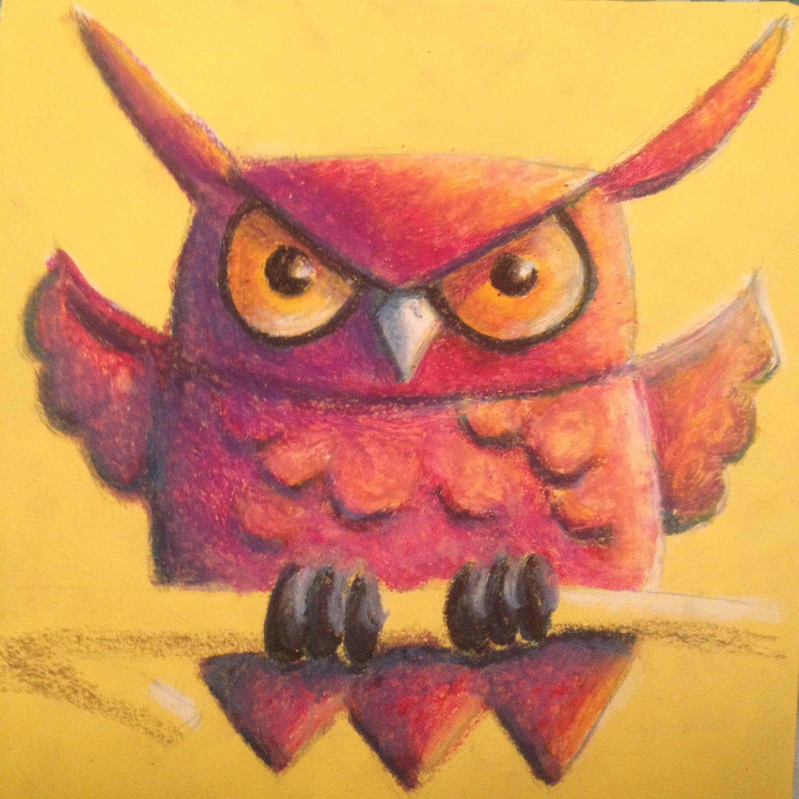
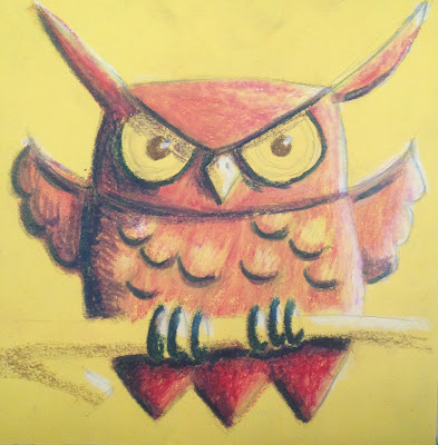
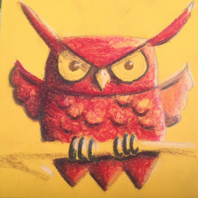
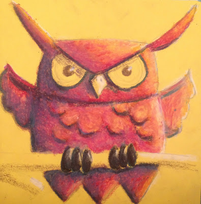
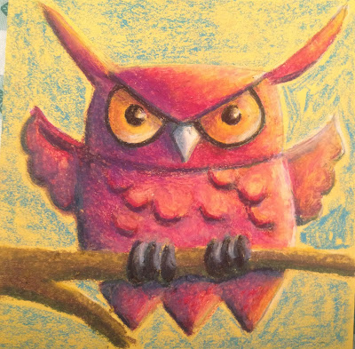
Samples of student (3rd grade) work:
—————————————————————————————————————–
There you have it, Project Owl as a classically trained artist might tackle a work. I’d love to hear any thoughts or input you all might have for improvement, what works and what doesn’t. Enjoy!
—
for the families of Verdugo Woodlands Elementary School
(Copyrights are retained by their owners. Images used here for educational purposes only)

 It’s been a busy few months with work, volunteering and the holidays coming up. I’m happy I’ve been able to put aside a little time to play around with some new techniques and tools. Keeping it loose this new take on George and the Dragon was inspired by word play/association. I wrote down a list of adjectives. The list was cut up and words were randomly grouped together. These in turn inspired images – this illustration came from ‘exhausted’, ‘gallant’ and ‘abusive’. The words are also found scattered in the painting.
 Additionally, I’ve been playing around with Gesso and newspaper transfer for an all school mosaic project. I’m looking forward to seeing the results after going through the hands of 800+ elementary school kids adding their individual illustrations.